


เรียน CSS Animation | Day 4 - Click Me!
เขียนวันที่ : Jan 7, 2023
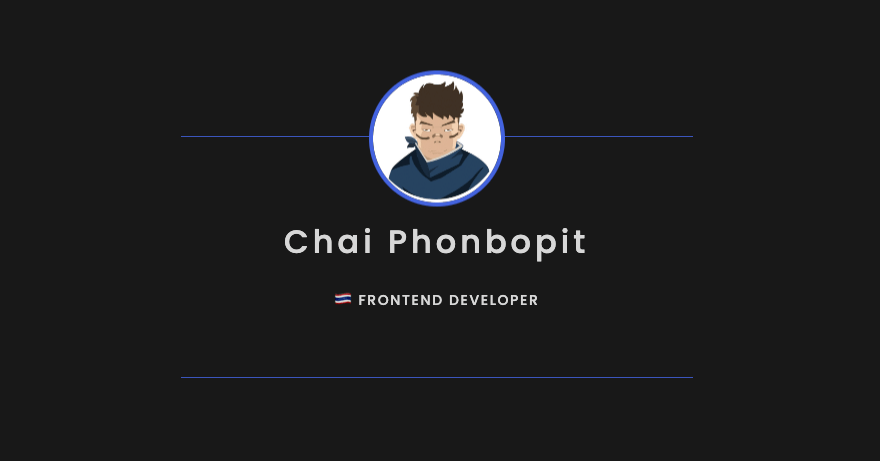
สวัสดีครับ วันที่ 4 เป็นการทำ ส่วนโชว์ Information โดยเมื่อกด click ก็จะมีข้อความขึ้นมา เป็น animation ครับ
Day 4 - Click Me
โค๊ดบน Codepen
See the Pen on https://codepen.io/phonbopit/pen/YzjGawG/
สามารถดูแบบ Video ได้จาก Link Youtube ครับ
Step 1 - สร้าง Markup
เริ่มแรกผมทำการสร้าง HTML ขึ้นมา โดยมีส่วนแสดง avatar และส่วน author ที่เอาไว้โชว์ information ที่ต้องการ (อาจจะใส่ link social หรือคำอธิบายตัวเองเพิ่มเติมได้ครับ แล้วแต่สะดวก)
<div class="container">
  <div id="avatar">
    <img src="https://0xchai.io/static/images/avatar.png" alt="avatar" />
  </div>
  <div id="author">
    <h3>Chai Phonbopit</h3>
    <p>🇹🇭 Frontend Developer</p>
  </div>
</div>
Step 2 - CSS
เนื่องจาก #author และ #avatar อยู่ตำแหน่งเดียวกัน ผมเลยกำหนดให้เป็น position: absolute และก็ปรับตัว .container ที่เป็น parent เป็น relative
@import url("https://fonts.googleapis.com/css2?family=Poppins:wght@500;700&display=swap");

:root {
  --primary-color: #4363df;
}

body {
  font-family: Poppins, sans-serif;
  background-color: #181818;
  color: #fff;
}

#avatar {
  display: absolute;
  transition: all 0.75s ease-in;
  transform: translateY(0);
  z-index: 10;
  cursor: pointer;
}

#avatar img {
  border-radius: 100%;
  border: 4px solid var(--primary-color);
  width: 128px;
  height: 128px;
}

#author {
  position: absolute;
  display: block;
  text-align: center;
  width: 480px;
  margin: 0 auto;
  border-top: 1px solid;
  border-bottom: 1px solid;
  border-color: var(--primary-color);
  padding: 1rem;
  transition: all 0.6s ease-in-out;
  opacity: 0;
  cursor: pointer;
}

#author h3 {
  font-size: 2rem;
  font-weight: normal;
  letter-spacing: 0.25rem;
}

#author p {
  font-weight: normal;
  text-transform: uppercase;
  letter-spacing: 0.1rem;
  font-size: 0.875rem;
  color: #fff;
}
ต่อมา ส่วนของ Transition ผมตั้งเป้าหมายว่า เมื่อเอาเมาท์ไปคลิก จะให้มัน add class ชื่อ .moveUp และให้ทำการ transition เพิ่ม padding และ opacity ให้กับ #author
#author.moveUp {
  padding: 4rem 1rem;
  transition: all 0.5s ease-in-out;
  opacity: 1;
}
Step 3 - JavaScript
ส่วนนี้เอาไว้จัดการ onclick โดย เมื่อ #avatar ถูกคลิ๊ก ให้ทำการเพิ่ม transform: translateY(-8rem) และเพิ่มคลาส moveUp
จากนั้นก็ setTimeout ให้มันลบ class ออก เพื่อกลับไป position เดิม
const authorElement = document.getElementById("author");
const avatarElement = document.getElementById("avatar");

avatarElement.addEventListener("click", () => {
  avatarElement.style.transform = "translateY(-8rem)";
  authorElement.classList.add("moveUp");

  setTimeout(() => {
    avatarElement.style.transform = "translateY(0px)";
    authorElement.classList.remove("moveUp");
  }, 2500);
});
สุดท้าย ผมก็ได้ ตัว Avatar ง่ายๆ คล้ายๆ นามบัตร (เผื่อเอาไว้ใส่ link ใส่รายละเอียดเพิ่มเติมได้)
ไว้เจอกันใหม่บล็อกหน้าครับ สวัสดีครับ
Happy Coding ❤️